Name Draft
Marcy Petrini
March, 2018
When it was announced that the theme of the Chimneyville Weavers and Spinners Guild’s 2018 exhibit was going to be “Here Comes the Sun”, I knew that I should try a name draft. Last year we went to Kentucky to see the total eclipse in August; just as the sun returned, someone in the field where we were parked to watch it started the music blasting – Here Comes the Sun! Perfect.
Shortly after that trip I wove a piece inspired by the eclipse, but the name draft seemed like a must-do. Convergence® writing and weaving samples has put the project on the back burner (the exhibit won’t be till the fall), but I encouraged some guild members to try name drafting with the title, I thought it would be fun to see how many variation we would get.
What is a name draft? It’s a way to design, traditionally using overshot, probably because we have four blocks, more than with other weaves on four shafts. In the way of review, overshot is a supplementary weft weaving structure based on a straight twill. On four shafts, here are the four blocks:
| 4 | 4 | |||||||||
| 3 | 3 | |||||||||
| 2 | 2 | |||||||||
| 1 | 1 | |||||||||
| Block A | Block B | Block C | Block D | |||||||
The threading of each block is usually at least two repeats (for example, A is 1, 2, 1, 2), but it can be more depending on the desired length of the “overshot” weft that covers the block.
Traditionally, the warp and ground weft are of the same size and color, generally neutral, and produce tabby, a balanced 50/50 plain weave by treadling 1 & 3 vs. 2 & 4.
To weave a block, we cover it with the pattern weft, which is two to three times thicker than the ground yarn and loftier. Thus, to weave block A, in a sinking shed loom we would lower shafts 1 and 2; in a rising shed loom, we would raise shafts 3 & 4, thereby leaving shafts 1 and 2 to be covered.
Here is a sample of overshot, the four blocks threaded A, B, C, D, C, B, A. The overshot areas are in dark blue, the tabby areas in white, and the half-tone areas, so called, as can be seen below, because there are both blue and white threads mixed together.

There are many, many overshot patterns available, but it is fun to design our own and name draft is an easy way to do it.
To design a name draft, we first pick a scheme by assigning a shaft to each letter. The scheme per se doesn’t matter, just as long as we are consistent. Here are two examples:
| Shaft 1 = | A | E | I | M | Q | U | Y |
| Shaft 2 = | B | F | J | N | R | V | Z |
| Shaft 3 = | C | G | K | O | S | W | |
| Shaft 4 = | D | H | L | P | T | X |
| Shaft 1 = | A | B | C | D | E | F | G |
| Shaft 2 = | H | I | J | K | L | M | N |
| Shaft 3 = | O | P | Q | R | S | T | U |
| Shaft 4 = | V | W | X | Y | Z |
You could also add numbers and punctuations. And because the number of letters in the alphabet and the number of shafts don’t come out even (26 is not divisible by 4), some like to double up, p and q, together for example, y and z, etc.
Next, we perform the following steps:
• Choose a name or a saying and convert it into threads on the four shafts using the chosen scheme.
• Adjust the threading so that the tabby (1 & 3 vs. 2 & 4) is maintained; that is, an odd shaft must be next to an even shaft; thus, for example, if a 1 is next to another 1 or a 3, we can either eliminate one thread, or add a thread; if we wanted to add, in this case we would choose an even thread, either 2 or 4. Throughout the draft we can use either addition or subtraction, whatever works to make the design pleasing.
• Overshot patterns are generally symmetrical, but they don’t have to be; if your draft doesn’t produce a symmetrical design, and you prefer one, either adjust the draft with incidental threads to make it symmetrical or reverse it to obtain its mirror image.
• If you are planning a finished product, for example, a table runner, add borders if it enhances the design; generally not needed if weaving yardage.
• Treadle tromp as writ (star fashion) or any of the other traditional overshot possibilities.
Are you ready to try one? Try your name, a common way to get started.
Next month – and that’s only two days away! – I will write up an example, using my name. “Here Comes the Sun” will have to be later, after Convergence®!
Please email comments and questions to marcy@marcypetrini.com.
Stripes and Gene Davis
Marcy Petrini
February, 2018
In the last blog we talked about warp stripes, but we can add weft stripes, too. The disadvantage is that the weft has to be changed often and there are those pesky tails to deal with. If the cloth is to be used in a garment where the edges don’t show, we can just leave them. Scottish tartans are woven that way if they will be made into kilts or other garments; the fabric is usually wool which is slightly fulled, locking in the ends anyway. The thinner the weft, the less likely is the build-up of extra tails at the edge. We can also use a technique tapestry: tapering the tail by un-plying and making each ply a slightly different length before tucking in the shed.
The advantage of weft stripes is that, if we don’t like a fabric, we can add a bit of pizazz with weft stripes. Of course weft stripes can be planned. Acadian textiles use colored cottons to their best advantages in weaving the weft stripes.
And horizontal wefts are needed to make plaids; this warp striped fabric

Can become this plaid:

When planning stripes, the conventional wisdom is to use contrasting colors – whether in hue, or value or saturation, or some combination of those – and to use the Fibonacci series for pleasing proportions. Originally described by the Italian mathematician Leonardo Fibonacci, it is a sequence where each digit is obtained by adding the previous two, after starting with 1 and 2:
1, 1, 2, 3, 5, 8, 13, 21, etc.
These ratios have been used since antiquity, are found in nature and they are all around us in everyday objects, for example, our 3 by 5 cards. In our weaving, we can use them in dimensions, for example in inches, or in the number of threads; they don’t have to be used in order, and they can be in ratios; for example, we could double 2 and 5 and make stripes of 4 and 10 threads.
I used these principles for years. Then one day I walked into the Corcoran Gallery of Art (now closed) and there in the rotunda was an incredible painting of stripes, “The Magic Circle”; it was Gene Davis’s work, which I didn’t know at the time. The more I looked, the more I became fascinated. Those stripes didn’t follow any rules for proportions or color, and yet they were so captivating.
Once in my consciousness, I kept on finding more of his work; in 2016 we visited the Milwaukee Art Museum during Convergence and there it is was – his work is unmistakable.
I became curious: what principles does he use? What makes his work so compelling to me?
I bought the annotated catalog, “A Memorial Exhibition 1987” which included many of his paintings as well as essays by various art critics. Gene Davis, who died in 1985, is considered the most prominent member of the Washington Color School; while his art work is varied, he is best known for his color stripes, often in paintings, but also with lights, and other media. I studied his work and spent a lot of time analyzing those stripes. Finally, in order to understand it better, I decided that I needed to make a hanging based on his “Hot Beat”, shown below on the loom

I am not sure that the warp did much for my understanding, but reading about an interview with him gave me the answer; Gene Davis basically said that he applied all of the art rules and then sought to break them!
So, there you have it! Maybe it is best to spend time training our eye and trusting it, so that we can have a feeling for what our stripes should be – Fibonacci or not.
Please email comments and questions to marcy@marcypetrini.com.
A big thank-you to Bambi Moise who pointed out the error in the Fibonacci series as originally posted. It should start with two "1's". It is now correct.
What Did I Get Done This Year?
Marcy Petrini
December, 2017
I am writing this blog at the end of December – the December blog! – but I know that with the busy life during the holidays, it won’t be posted until after the first of the new year. There is a reason for the traditional January 7th Roc Day, when the women returned to their fiber chores after the holidays!
I hope you had a wonderful holiday season and Happy 2018!
I don’t like to make new year resolutions, but as the old year ends and the one is about to begin, I like to assess what I have accomplished this past year and what the future is likely to bring.
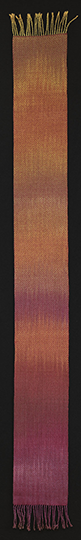
My favorite piece this year is the plaited twill silk shawl, shown in my April 2017 blog; when asked to represent HGA for the fall issue of Fiber Art Now, I chose it and I am thrilled that it appears in in the “Spotlight on Organization” section. This is what I said in response to the question “What do you love about HGA?”
The sense of community, the educational opportunities, and the link between past and future. I became involved with HGA when there was no internet and a few written sources; the weavers across the country became my community of mentors, always willing to help. It was a thrill to meet them in person at Convergences®, where I learned more from them and others. Now it’s my generation’s turn to be mentors to ensure the future of our crafts. Through the Fiber Trust and scholarships, HGA offers valuable resources to young and upcoming fiber artists.
While that was my favorite piece of 2017, there were other weaving, knitting, spinning (a pound of red silk took nearly one year), and braiding; of the weaving (17) and knitting (8) pieces that were finished, the range was scarves, shawls and soft sculptures for exhibits, samples for our guild study group, writing and teaching, and one or two for new challenges – new yarn, new project, etc.
|
|
One of my friends brought me back a painted warp for two scarves from a conference and the challenge was to find two wefts that would work. The warp is cotton and rayon, size 10/2; I tried black, but it was too dark, making the warp colors almost disappear; even though gold is one of the warp colors, when used in the weft, it was just too much. Finally I found that cinnabar (for the scarf on the left) and copper (on the right) worked well; both colors are in the warp. |
|
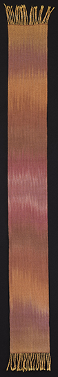
Both wefts are 50% wool, 50% silk, perfect for cold evenings. Both scarves were woven with a twill from Davison called a shadow twill – not shadow weave. Looking at the drawdown, we can see why she calls it “shadow”, the little motifs formed by the warp are shadowed by the weft.
Note that the treadles tied with 4 & 3, and 1 & 2 are duplicates, but since I have six treadles on the four shaft loom, tying these twice makes the treadling more efficient.
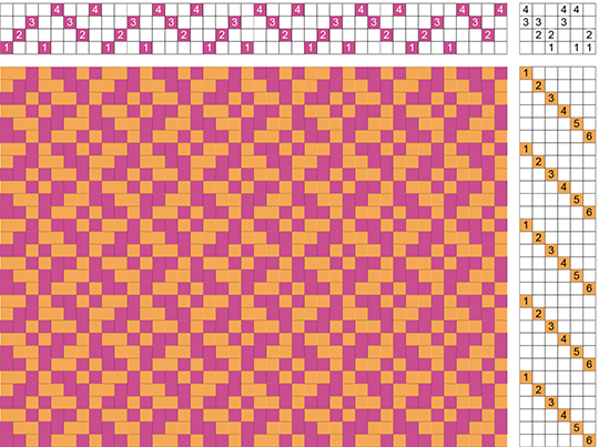
Click here for the full-sized draft (a PDF will open a new window)
For 2018, the challenge is Convergence®. Four classes, four monographs and already over 60 participants signed up! I wish you a happy, fiber-filled 2018 and I do hope to see you in Reno!
Please email comments and questions to marcy@marcypetrini.com.
Stripes!
Marcy Petrini
January, 2018
Warp stripes are a (relatively) easy way to add color and design to our weaving – and there are many ways to include stripes, from sequential to random, from one color to several, and from thin to gradation, where we start with a background color and a stripe of a different color and slowly the stripe color becomes background and the background becomes color stripes as in the scarf below:

I say that stripes are relatively easy to add because it is also easy to make mistakes; two tend to occur: one is when we reverse the order of the bouts of warp, the other is when we flip the top and bottom of a bout. Examples will make this clearer and help avoid errors in the future.
Let’s say that we have bouts of 4” for a 20” shawl. This is the color stripes layout we have made; the ground is black; the stripes are in sets of yellow (½”); orange (1”); red (1 ½”):
Bout # 1 = 4” |
Bout # 2 = 4” |
Bout # 3 = 4” |
Bout # 4 = 4” |
Bout # 4 = 4” |
| 4” black | 1.0” black 0.5" yellow 1.0” orange 1.5” red |
4” black | 0.5" yellow 1.0” orange 1.5” red 1.0” black |
4” black |
It is easy to see that swapping bouts # 2 and # 4 with any other bout would cause disaster. Always number the bouts the same way and then place them on the loom in the same way and in order. For example, I always tag the number the beginning of the bout, close to the warping board, and then I place each bout starting at the left side as I face the back of the loom, so that each tag is on the left of the bout. We have to be paying close attention and it’s still possible to make a mistake.
And I have made that error! Fortunately it was before I wound the warp on the loom (I dress from the back to the front); I noticed the odd stripes when I was spreading the warp at the cross; all I could do was re-tie the bouts, remove them from the back rod, and put them back in the right order.
You can have all of the bouts in the correct order and still make a mistake if one (or more!) is flipped. For example, image bout # 2 above, lined up in the back of my loom:
| ||||||||||||||| | ||||||| | ||||||||||||||| | |||||||||||||||||||||| |
But if I flip the bout, my order will be red, orange, yellow and black. Not good!
This flipping can be avoided by tying the cross at the warping board differently at the top and the bottom.

In the figure above, you see that the top of the cross was tied with a yellow handle, the bottom with two separate red ties.
On the loom, the lease sticks are added so that the handle (white in this case) is up, as shown below. This helps not only with keeping me from flipping the warp, but also from twisting it, where one lease stick has the top of the warp on top and the other the bottom of the warp on top.

These type of errors, too, require re-placing the bout in the correct order and orientation. It is better to avoid it.
How do we design stripes? The February blog is just around the corner….

Please email comments and questions to marcy@marcypetrini.com.
Jurying a Convergence® Exhibit
Marcy Petrini
November, 2017
I am so honored that the 2018 Convergence® committee asked me to be the juror for the Truckee River Yardage Exhibit. The committee asks the jurors of the various exhibits to give talks, which is a wonderful way for the juror to explain how and why s/he chose the pieces that were chosen and for the participants to understand the method that the particular juror used.

Not surprisingly, I have been on both sides of the process, and whenever I think about it, I am always reminded of what one of my mentors early in my weaving career admonished, as she was trying to convince me to submit to a juried exhibit: “there will be times that you won’t be accepted, of course, “ she said, “it happens to everyone; you will first think that the juror is an idiot, later you will think you are an idiot, and finally you will come to your senses and try to see what you can learn from the experience, because that is the real reason to participate.” So true!

There are two kinds of exhibits; the first is open entry; most guild shows are open to its membership, or perhaps even to others; a juror then chooses pieces for the awards. I have juried this kind of exhibit and, while they may seem easy to judge, there are some underlining comparisons that make it really heard: how do you compare an exquisite garment with a wonderful tapestry? Then there is the comparison among participants: one piece may have been submitted by someone who is a long time artist, perhaps she sells her work, or maybe he teaches workshops on the technique used in the show piece; another entry may have been made by someone who has just started the journey and is a first time participant. Clearly we wouldn’t expect the same level of expertise between these two groups, yet they are in the same exhibit, vying for the same awards.
The other kind of exhibit is when only pieces that have been chosen by the juror are shown; the Truckee River Yardage Exhibit is one of those. In this case I will be comparing “apples to apples”; I will choose entries from swatches and then select pieces for awards on site. But I will likely receive many more entries that I am allowed to choose, because of space constraints. That’s when subtle differences in craftsmanship may matter, or when the complexity of the cloth may add to the aesthetics, for example.

A few years back I was at the instructor exhibit at Convergence® (which is by invitation) where one of my colleagues showed me her exquisite piece; baffled, she told me that it had won an award at a previous exhibit and yet had not been accepted for one of the juried exhibit at that Convergence®. Was the juror an idiot? It’s tempting to think that, but actually there may have been other circumstances that prevented her piece from being selected, the most common of which is that there is a theme that the juror is to follow, or the juror may look for pieces that fit well together for an overall scope.

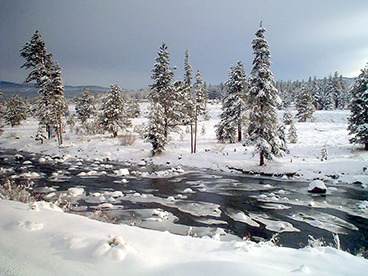
Which brings me to the theme of this exhibit: the Truckee River. I have heard complaints from people that HGA announces the exhibit themes too late. But these themes are broad. Look at the images in this blog: they are all of the Truckee River, which I have obtained from the web. A river may make you think of rippling blue water, but these images show just about every color and texture that you may want to use for yardage. Just give it the appropriate name: inspired by a season (“Winter on the Truckee”), or the time of day (“Sunset at the Truckee”); research the topic and use as much imagination in naming the piece that you did in producing it. Here is a link to the exhibit information: http://www.weavespindye.org/convergence-2018-yardage-exhibit.
I hope to see you in Reno!
Please email comments and questions to marcy@marcypetrini.com.
Page 18 of 28