
|
More Sapphire! |
Marcy Petrini
March, 2026
In February, I described how I arrived at finding the sapphire colors I needed to design a scarf for the Chimneyville Weavers and Spinners Guild 45th Anniversary celebration. I used Munsell 10 blue for the sapphire blue and Munsell 10 yellow for the sapphire yellow.
The scarf is off the loom and in the exhibit that the CWSG organized for our celebration. Here is a photo:
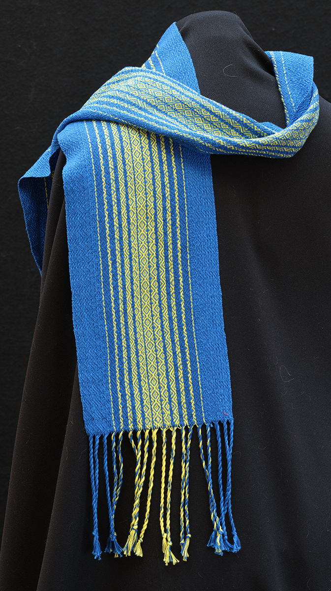
The two opponent colors – blue and yellow – with the twill lines make the scarf shimmer in the light as we can see from the photo.
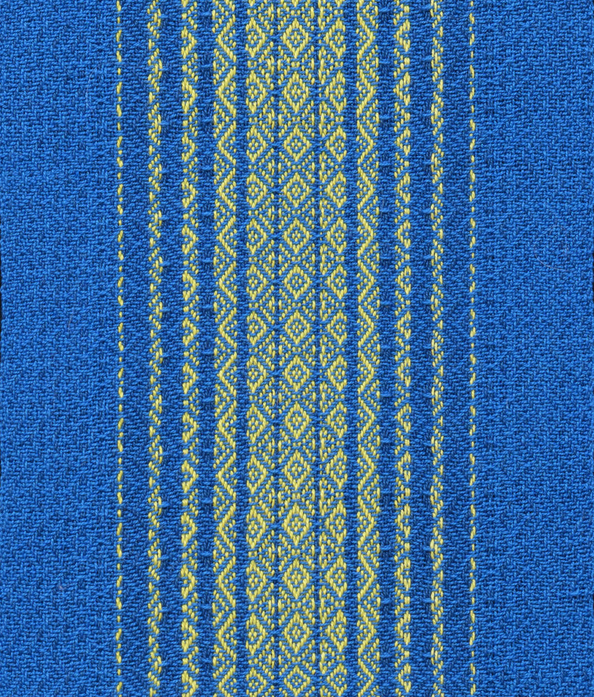
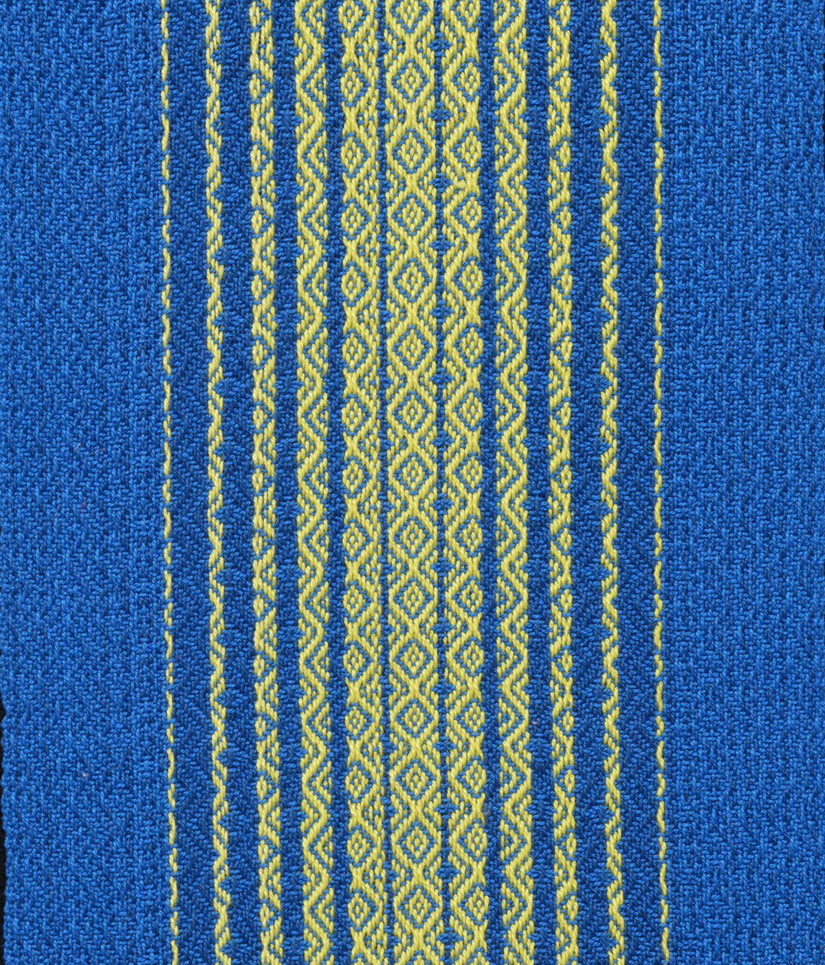
Below are close-ups of the front and back of the scarf.
 |
 |
When researching what is considered the standard sapphire blue, I came across other sapphires with descriptors to distinguish them from the standard. Once I was settled on what I wanted to weave, I became curious how these different sapphires may look.
I found six other hues (Munsell’s terminology for color) that carry the sapphire name: bright sapphire, deep sapphire, royal sapphire, cobalt sapphire, Pantone’s blue sapphire and one simply called sapphire by some, but dark cyan by others.
Just as in the standard sapphire blue, all these other sapphire hues have hex numbers which can be translated into the percentage of RBG out of 100% for each color. Two other parameters can also be calculated: the value and the saturation.
The value as used in the Munsell’s system – also known as lightness in computer graphics – represents how light or dark the color is, obtained by adding black or white; a value of 100% is pure white, 0% is pure black.
Saturation is similar in concept to Munsell’s chroma, how much of a given hue is present; this allows us to distinguish sky blue from navy blue.
It’s fun to see how these sapphire hues compare. Below are tables with the numerical information and squares of the hues for comparison (much of the information is from ColorHexa.com).
|
Color Name |
Standard Sapphire |
Bright Sapphire |
|
Hex Code |
0f52ba |
0067bc |
|
Red |
6% |
0% |
|
Green |
32% |
40% |
|
Blue |
73% |
74% |
|
Lightness (or Value) |
39% |
37% |
|
Saturation |
85% |
100% |
The standard sapphire blue is vibrant from the red / green interaction; the bright sapphire blue has no red, more green and a similar amount of blue. As a result, bright sapphire is more saturated, resulting in a deeper color.
|
Color Name |
Standard Sapphire |
Deep Sapphire |
|
Hex Code |
0f52ba |
082567 |
|
Red |
6% |
3% |
|
Green |
32% |
15% |
|
Blue |
73% |
40% |
|
Lightness (or Value) |
40% |
22% |
|
Saturation |
85% |
86% |
Again, the standard sapphire blue is vibrant from the red / green interaction; the deep sapphire blue has much less red, green and blue. With this smaller amount of illumination, the sample is much darker (the lightness/value is less).
|
Color Name |
Royal Sapphire |
Cobalt Sapphire |
|
Hex Code |
305cde |
0047ab |
|
Red |
19% |
0% |
|
Green |
36% |
28% |
|
Blue |
87% |
67% |
|
Lightness (or Value) |
53% |
34% |
|
Saturation |
73% |
100% |
The brightness of the royal sapphire is also from the red/ green interaction that we saw in the standard sapphire, with more red and a higher value. Compared to it, the cobalt sapphire is intense, with no red, relatively more blue and a higher saturation. The cobalt sapphire is darker since the red, green and blue numbers are all smaller than with the royal sapphire.
I found it interesting that the Pantone’s Blue Sapphire has a lot of green, leaning it toward teal; and following that lead, a color called dark cyan by ColorHexa.com is called “Blue Sapphire” by others. Given that the green sapphire gems are some of the rarest, those color names are understandable.
|
Color Name |
Pantone’s Blue Sapphire |
Blue Sapphire (Dark Cyan) |
|
Hex Code |
126180 |
006e75 |
|
Red |
7% |
0% |
|
Green |
38% |
43% |
|
Blue |
50% |
46% |
|
Lightness (or Value) |
29% |
23% |
|
Saturation |
75% |
100% |
The deep teal of the Pantone sapphire is from more red and less saturation than the blue sapphire / dark cyan. The dark cyan has nearly equal amounts of green and blue and full saturation resulting in cyan being a better descriptor of the hue.
By the way, if you print this blog, the sapphires may not look the same as on the screen because, while the RGB code is how the screen’s pixels present colors, printers use CMYK inks – hence some sort of conversion is needed.
What a wonderful experience! Who knew that starting with a simple question – how did we get from sapphire the gem to sapphire the color? – would lead to a path that taught me some color history, some color nomenclature and more about the interactions of colors.
Check out the ColorHexa.com website, it’s a great resource for thinking about color schemes for your yarns.
Happy Weaving in Color!
Marcy
|
More Sapphire! |
Marcy Petrini
March, 2026
In February, I described how I arrived at finding the sapphire colors I needed to design a scarf for the Chimneyville Weavers and Spinners Guild 45th Anniversary celebration. I used Munsell 10 blue for the sapphire blue and Munsell 10 yellow for the sapphire yellow.
The scarf is off the loom and in the exhibit that the CWSG organized for our celebration. Here is a photo:
The two opponent colors – blue and yellow – with the twill lines make the scarf shimmer in the light as we can see from the photo.
Below are close-ups of the front and back of the scarf.
|
|
When researching what is considered the standard sapphire blue, I came across other sapphires with descriptors to distinguish them from the standard. Once I was settled on what I wanted to weave, I became curious how these different sapphires may look.
I found five other hues (Munsell’s terminology for color) that carry the sapphire name: deep sapphire blue, royal sapphire, cobalt sapphire, Pantone’s blue sapphire and one simply called sapphire by some, but dark cyan by others.
Just as in the standard sapphire blue, all these other sapphire hues have hex numbers which can be translated into the percentage of RBG out of 100% for each color. Two other parameters can also be calculated: the value and the saturation.
The value as used in the Munsell’s system – also known as lightness in computer graphics – represents how light or dark the color is, obtained by adding black or white; a value of 100% is pure white, 0% is pure black.
Saturation is similar in concept to Munsell’s chroma, how much of a given hue is present; this allows us to distinguish sky blue from navy blue.
It’s fun to see how these sapphire hues compare. Below are tables with the numerical information and squares of the hues for comparison (much of the information is from ColorHexa.com).
|
Color Name |
Standard Sapphire Blue |
Deep Sapphire Blue |
|
Hex Code |
0f52ba |
0067bc |
|
Red |
6% |
0% |
|
Green |
32% |
40% |
|
Blue |
73% |
74% |
|
Hue |
216.5O |
207.1O |
|
Value |
40% |
37% |
|
Saturation |
85% |
100% |
Other impurities result in the other colors, but the chemical interactions are different since it is only one impurity that produces the color: chromium gives us ruby, a corundum of various reds; vanadium results in purples; black corundum, called emery and used as an abrasive, has a mixture of magnetite, hematite and spinel.
But how did we go from these gems to one generally accepted standard blue sapphire?
The naming and standardization of colors is an interesting subject. In 1929 Munsell derived a system that fiber artists still find useful today. He used a chromatography technique to measure color but also included the psychological portion of color detection. His purpose was not fiber but paper, and other uses, for example food science and soil.
In 1930, Maerz and Paul published A Dictionary of Color which was revised in 1950.

In it they categorized colors with names already in use at the time and matched them to the Munsell system when possible.
In 1956, Color, universal language and dictionary of names, by Kenneth Low Kelly, standardized colors as part of the National Bureau of Standards. The 1976 revision is available for purchase as a black and white reprint, but it has no color plates (!). However, it can be downloaded for free from the NBS with the original color plates as shown below.

Pantone arrived at its own system in 1963, which extends to many different materials, including shiny metallic colors. It is widely used in fashion and in the printing business.
With the arrival of computers, a way to determine the position of each color on a screen was needed; the RGB was standardized (sRGB). When the web arrived in the 1990s, programmers needed a better way to define colors across platforms. The hex system was introduced in 1996 with the first specification of the Cascading Style Sheet used by web programmers. It became the standard.
The hex 0F52BA (on a scale of 0 to 255) is the most widely accepted sapphire number.

I color-coded the hex number because each pair of digits represents a color in the system used for our computer screen, RGB. For the sapphire number, we have 15 Red, 83 Green and 186 blue, which I find easier to think in percentages: 6% of the red (of the total 100% possible red), 32% of the green and 73% blue.
From the hex number, we can find the equivalent color in other systems, for example the cyan, magenta, yellow and black, the colors of our printer cartridges. Pantone uses names which corresponds to hex numbers when possible (but not for the metallics, for example).
It was time to weave. I searched the internet for a yarn with the color sapphire with no luck. My friend Gio Chinchar had the same result.
Time to look at what available colors with known specifications can come close to sapphire.
Lunatic Fringe has yarns that follow the Munsell system. They also have cards for all their colors with information, including the hex number, the RGB number, the value and the Pantone number.
At this point I had looked at enough sapphire blue to think that Mansell Blue 10 could work. This is my favorite blue, and I have used it a lot.
The RGB percentages for the Munsell 10 blue are: 0% red, 31% green and 66% blue. It has a value of 70 (on a scale of 0 to 100), while Sapphire has a value of 60. All and all, not a bad match; 10 Blue has no red, but it has a higher value and thus a bit darker.
To contrast the 10 Blue, I wanted to use a yellow. Doing an after-image gave me a bright yellow. I thought the 10 Yellow would work, but I thought I should check it, especially since yellow sapphire has a hex number.
Here is the comparison:
|
Yellow |
100% Red | 84% Green | 0% Blue |
| 10 Yellow: | 99% Red | 89% Green | 0% Blue |
Good match!
Finally, it was time to design the project, a scarf. I thought it may be fun to call it:
Diamonds Sapphires are a girl’s best friend
This is the entire drawdown for the 8” scarf, no repeats. Lots of diamonds sapphires!

Scarf is still on the loom… stay tuned…..
Happy Weaving!
Marcy
|
Sapphire! |
Marcy Petrini
February, 2026
At the September 2025 meeting of the Chimneyville Weavers and Spinners Guild Vice President Donna Peyton issued a challenge: to celebrate the guild’s 45th Anniversary, each one of us should use a Sapphire color to create a fiber project. The guild will have an exhibit during Sheep to Shawl and pieces are due at the February meeting.
Donna provided a one-page handout chock full of information: the various colors of the sapphire gems, not only various blues, but also pink, yellow, purple, and green. She also included the RGB hex number of Sapphire blue and how it looks.
I knew already that hex numbers define colors according to their composition (red, green and blue, RGB), but how did we go from a gem of various colors to one hex number? Now I had homework to do. Since I am interested in the science of color, this project has been a nice “rabbit hole” to go down, especially since I took my husband Terry Dwyer with me (very helpful with the chemistry and physics). It has resulted in many interesting conversations at the dinner table.
First, the gem. Sapphire is classified as a corundum, a colorless aluminum oxide (Al2O3, for you chemists) with an interesting chemistry. When tiny impurities of titanium and iron replace the aluminum, the corundum can change color. When titanium alone replaces some of the aluminum, the corundum is colorless. If iron alone replaces some of the aluminum, the sapphire can be yellow or green. It’s the combination of the two that gives us blue. Different chemical interactions between titanium and iron give us different blues, darker with more iron, more brilliant from the titanium.
 |
| Image from Sapphire Color Value Chart (which would really like me to buy a sapphire). |
Other impurities result in the other colors, but the chemical interactions are different since it is only one impurity that produces the color: chromium gives us ruby, a corundum of various reds; vanadium results in purples; black corundum, called emery and used as an abrasive, has a mixture of magnetite, hematite and spinel.
But how did we go from these gems to one generally accepted standard blue sapphire?
The naming and standardization of colors is an interesting subject. In 1929 Munsell derived a system that fiber artists still find useful today. He used a chromatography technique to measure color but also included the psychological portion of color detection. His purpose was not fiber but paper, and other uses, for example food science and soil.
In 1930, Maerz and Paul published A Dictionary of Color which was revised in 1950.
In it they categorized colors with names already in use at the time and matched them to the Munsell system when possible.
In 1956, Color, universal language and dictionary of names, by Kenneth Low Kelly, standardized colors as part of the National Bureau of Standards. The 1976 revision is available for purchase as a black and white reprint, but it has no color plates (!). However, it can be downloaded for free from the NBS with the original color plates as shown below.
Pantone arrived at its own system in 1963, which extends to many different materials, including shiny metallic colors. It is widely used in fashion and in the printing business.
With the arrival of computers, a way to determine the position of each color on a screen was needed; the RGB was standardized (sRGB). When the web arrived in the 1990s, programmers needed a better way to define colors across platforms. The hex system was introduced in 1996 with the first specification of the Cascading Style Sheet used by web programmers. It became the standard.
The hex 0F52BA (on a scale of 0 to 255) is the most widely accepted sapphire number.
I color-coded the hex number because each pair of digits represents a color in the system used for our computer screen, RGB. For the sapphire number, we have 15 Red, 83 Green and 186 blue, which I find easier to think in percentages: 6% of the red (of the total 100% possible red), 32% of the green and 73% blue.
From the hex number, we can find the equivalent color in other systems, for example the cyan, magenta, yellow and black, the colors of our printer cartridges. Pantone uses names which corresponds to hex numbers when possible (but not for the metallics, for example).
It was time to weave. I searched the internet for a yarn with the color sapphire with no luck. My friend Gio Chinchar had the same result.
Time to look at what available colors with known specifications can come close to sapphire.
Lunatic Fringe has yarns that follow the Munsell system. They also have cards for all their colors with information, including the hex number, the RGB number, the value and the Pantone number.
At this point I had looked at enough sapphire blue to think that Mansell Blue 10 could work. This is my favorite blue, and I have used it a lot.
The RGB percentages for the Munsell 10 blue are: 0% red, 31% green and 66% blue. It has a value of 70 (on a scale of 0 to 100), while Sapphire has a value of 60. All and all, not a bad match; 10 Blue has no red, but it has a higher value and thus a bit darker.
To contrast the 10 Blue, I wanted to use a yellow. Doing an after-image gave me a bright yellow. I thought the 10 Yellow would work, but I thought I should check it, especially since yellow sapphire has a hex number.
Here is the comparison:
|
Yellow |
100% Red | 84% Green | 0% Blue |
| 10 Yellow: | 99% Red | 89% Green | 0% Blue |
Good match!
Finally, it was time to design the project, a scarf. I thought it may be fun to call it:
Diamonds Sapphires are a girl’s best friend
This is the entire drawdown for the 8” scarf, no repeats. Lots of diamonds sapphires!
Scarf is still on the loom… stay tuned…..
Happy Weaving!
Marcy
|
Roc Day & Cotton |
Marcy Petrini
January, 2026
After one year hiatus, it was great to be back at Roc Day. The River Road Fiber Guild hosted in Plaquemine, LA and it was wonderful – good friends, good food and fun activities. Chair Charlene Bishop, Stephanie Keenan, Margaret Garnier and the rest of their “crew” organized everything to perfection. They even cooked for us!
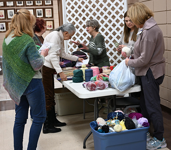
Our guild, the Chimneyville Weavers and Spinners Guild had several attendees. We had a “de-stash” table to raise some money for our educational activities and participated in demonstrations as shown below.
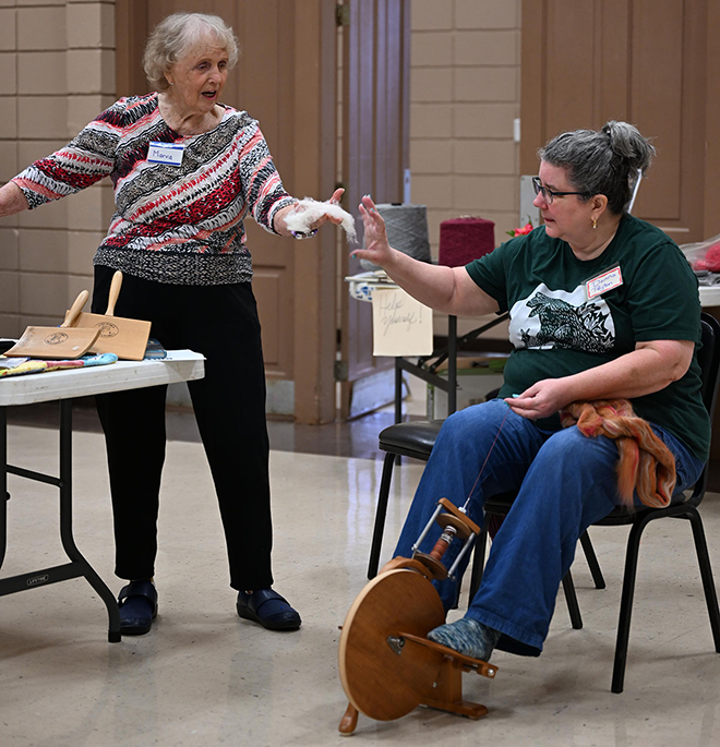
I was asked by Charlene to talk a bit about the Roc Day history. I had written an article about it with emphasis on Mississippi since it was for the digital Mississippi Folk Life publication, but it describes what Roc Day is and some of its origins.
There were door prizes. One of the participants won a lovely box of various cottons to spin: Pima, Acala, brown and green. She came to me to ask me how they were different. I could answer some of her questions, but I couldn’t remember all the details. I told her that I had written a one - page flyer “a couple of years ago” for inclusion in some of the Roc Day goodie bags and I promised I would go home, look for it and send it.
And I did. But the “couple of years ago” were actually 12 since the last revision!
I remembered that Ply magazine recently published an issue on plant fibers which included an article on cotton by Jill Duarte. There wasn’t much new in the article about the cotton plants from what I had written in the flyer, but it made me focus on clarifying my descriptions. I added the article in the bibliography and when I emailed the cotton flyer to my new spinning friend I recommended the article to her so she could learn more about spinning cotton.
Here is a copy of the flyer, including a nice photo of a cotton boll that my husband Terry Dwyer took when I first did the handout, almost 20 years ago! (Download the PDF).
Happy Spinning or Weaving!
Marcy
|
(Almost) Always Mix, Never Worry |
Marcy Petrini
December, 2025
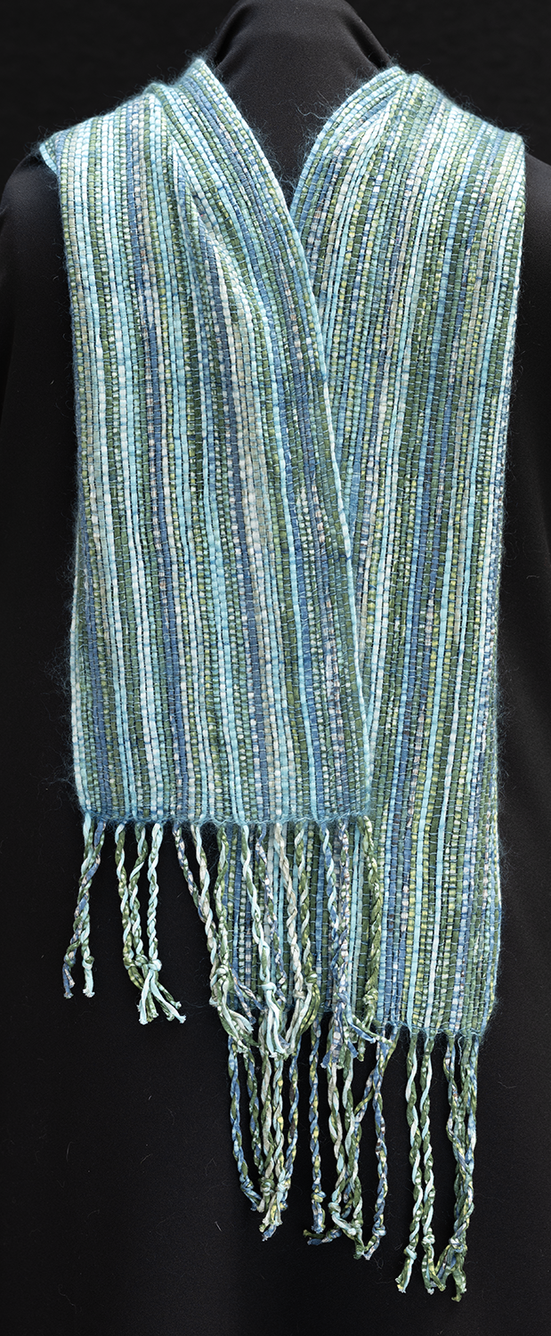
“Always mix, never worry” is my motto. I weave a few scarves for our co-op a year and I generally use at least two types of yarns, one for the warp, another for the weft, although sometimes one or the other or both are also mixed. Below is a scarf with a warp of Italian cotton ribbon and a thin weft of 72% kid mohair and 38% silk.
I use nice and sometimes unusual yarns, ones that I have on hand, to keep the cost low and the price for the customers reasonable. Right now, on the loom, getting ready for our Oxford, MS, festival, I have a warp of 80% silk and 20% lavender from https://www.wearwithalltextile.com/ and a weft of mohair and wool blend.
BUT – and here is the big BUT – when I mix, I am familiar with each of the yarns. I have used them before, or if they are new to me, I generally sample them to get to know their characteristics before incorporating them into a project.
My winter weaving class at the Bill Waller Craft Center (https://www.mscrafts.org/) will be starting next week and the subject is for students to weave any item with a fiber they have never used. My suggestion is that they use the same fiber for the yarns for warp and weft. That’s because when using a fiber for the first time, no matter how much you may read about them, you have to learn about them by doing.
The same it’s true for spinning. Once familiar with a fiber, spinners blend to obtain some of the characteristics of each fiber, to make the blend more affordable, or to make it easier to spin.
It’s not surprising that the “Shave ‘em to Save ‘em” initiative of the Livestock Conservancy (https://livestockconservancy.org/get-involved/shave-em-to-save-em/) requests that “show and tell” on their Facebook feed not be of a mixed fiber. The spun yarns and finished products should be one of the sheep breeds on the endangered list not mixed with other breeds or other fibers. To learn about these breeds that we may lose if not protected means that we use them singly first and foremost.
Recently at our guild meeting a member suggested to another spinner that she blend silk with wool to make it easier to spin. The spinner had never spun silk before, and the silks were those below: Bombyx, Muga, Eri, and Peduncle Tasar.
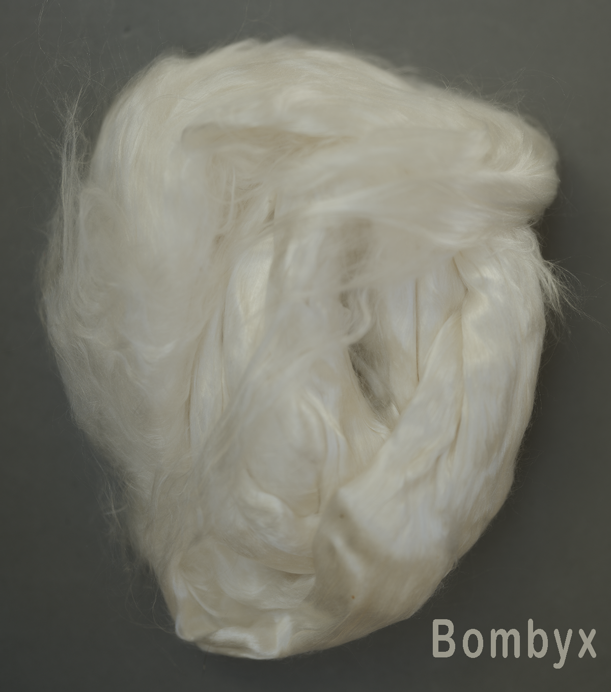
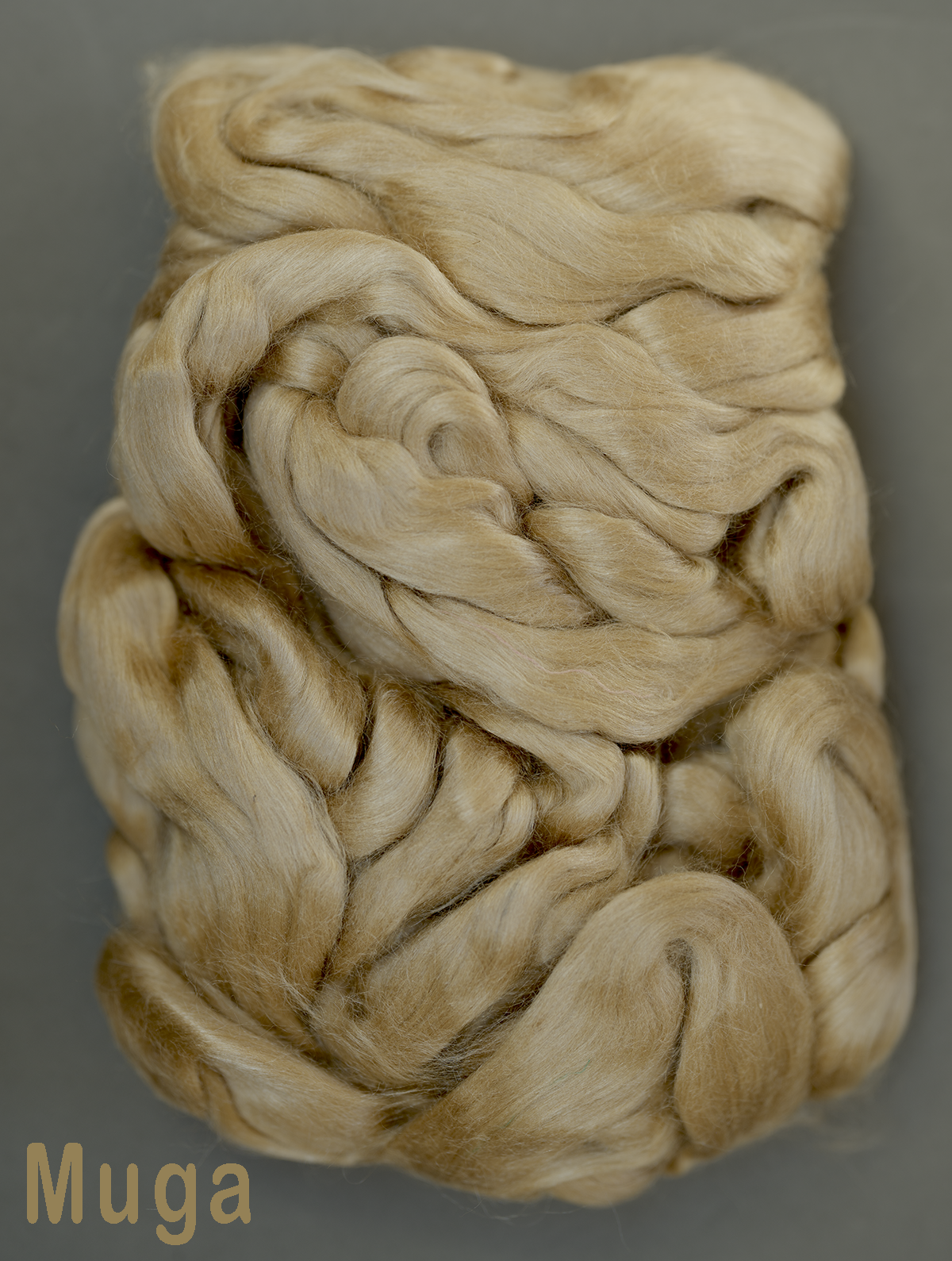

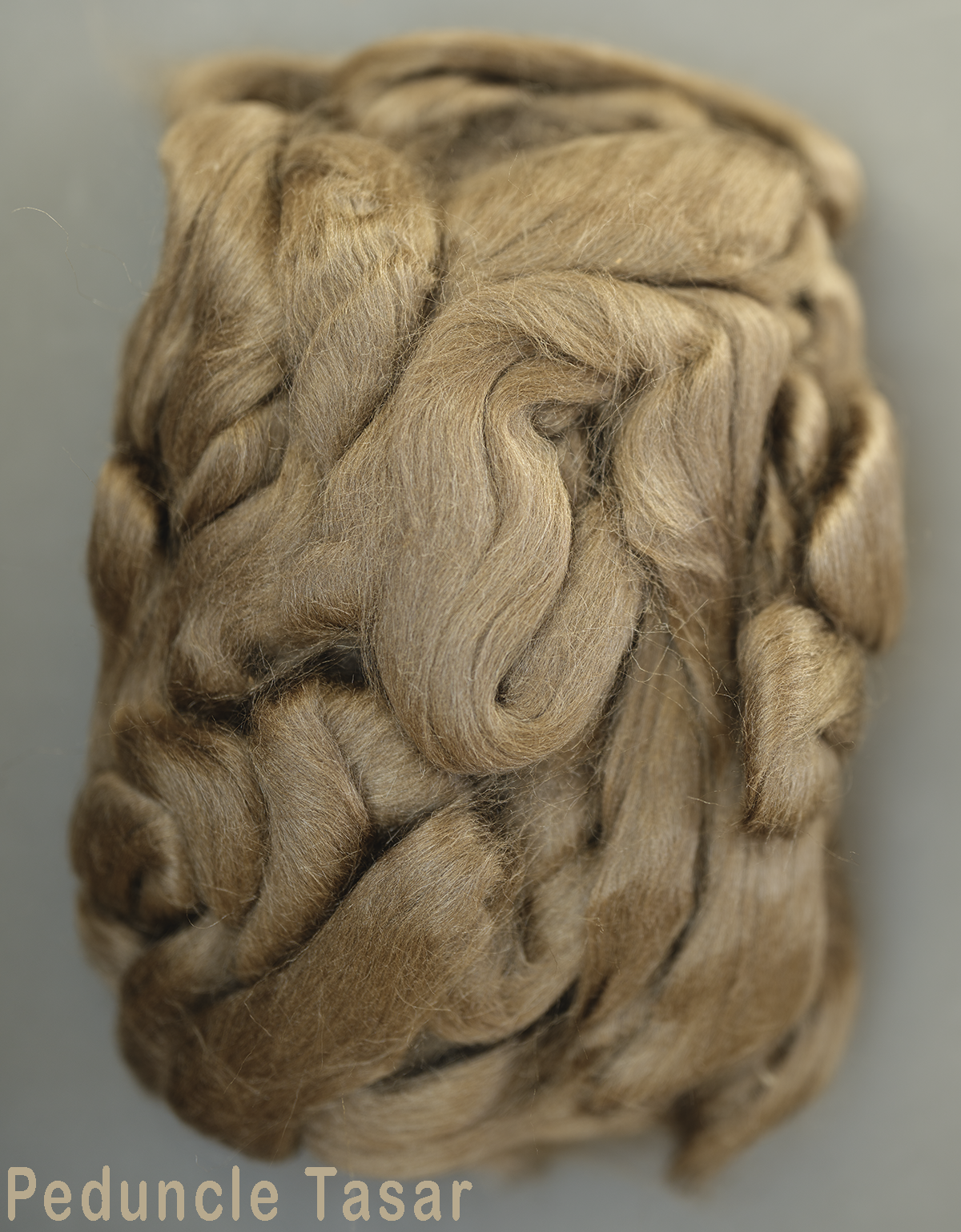
I reacted rather negatively to the suggestion. Even if someone has spun the usual bombyx, these silks are so different that it would be impossible to learn about them by combining them with anything or even each other.
These silks have come to the market rather recently and I fear that they are going to become scarce because of tariffs. So, it behooves us to learn about them while we can.
Mix and not worry, in weaving or spinning but only if you are intimately familiar with the fiber.
Happy Weaving and Spinning in 2026!
Marcy