Convergence® Evaluations
Marcy Petrini
October, 2016
I received the seminar evaluations from Convergence® and they are very encouraging. Maybe I will be chosen to teach at the next Convergence®!
I take the evaluations very seriously and so does the committee. As the slogan of the commercial says: “Never stop improving!”
One suggestion, made by a couple of people, caught my attention: to use a PowerPoint presentation instead of talking from the monograph.
On the surface, the suggestion sounds good, and it is one that I had given a lot of thought before the conference. As a veteran faculty member for over 30 years, I took a class on how to use PowerPoint when it was first introduced, and I have used it ever since, albeit different versions.
So, why don’t I use PowerPoint at Convergence®?
First let me say the circumstances when I do use it – then I will explain some important differences.
When I teach trainees, we have a curriculum. I know what they know (or at least should know) and I know what I must discuss in the talk that I am giving. The students receive a copy of the slides that I use and they can add notes if they so wish.
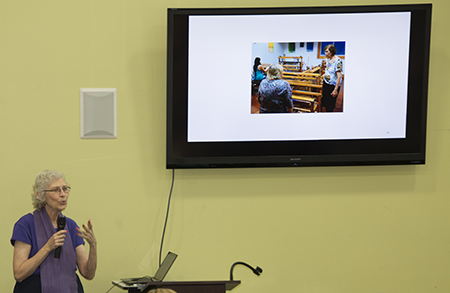
Another good use is when I give a broad talk to a general audience. That was the case this past spring when I received the Lifetime Achievement Award from the Craftsmen’s Guild and I gave a talk about my involvement with Guild, shown below. It was an historical prospective, and if somebody in the audience didn’t know me or the Guild, they would have gotten a snapshot of the last thirty-five years with slides showing past Guild events and people.

Somewhere between these two cases is when I used to present results of my studies at medical conferences; attendees receive an advance copies of all of the abstracts to be presented and each individual can choose what to attend; the material is new, but only those people familiar with the specific field are likely to be interested in hearing what a speaker has to say. PowerPoint slides can show tables, graphs, videos, photos, etc.
None of these circumstances are true for the seminars I taught at Convergence®. While the topics may seem specific, the background of the attendees is very varied. In a past twill seminar, for example, I had an attendee who had just learned to weave and had never woven a twill before and another who wove lots of twills but wanted an overview so she could design her own.
When I present from the monograph, I know what material is there, but I am able to either linger on a topic or be brief, because I can watch the audience. If everyone is nodding, no sense in spending more time on that topic; if people look puzzled, it’s time to slow down and go over the material in a different way. If people are taking notes, I slow down so they won’t get behind.
If I were presenting from slides, this would not be possible: for one thing, the audience would be watching the screen and not me; and I would be watching the screen as well; the lights would likely be dimmed, so adding notes may not be as easy. If I needed to cover a topic in a slightly different way, I may not have the right slide, and I wouldn’t even know it. Similarly, I wouldn’t know to skip slides that are not needed.
The other thing that watching my audience does for me is to allow me to gauge when people are getting unfocused. The rule of thumb is 20 minutes, but 20 minutes is an average for all topics and all listeners; it could be 15 or it could be 30. As I watch people, I can tell when attendees are getting tired, I switch to a tale, or a joke. It breaks up the material and allows a mental breather.
Another consideration is the quality of the colors. When my husband Terry Dwyer takes photos of the samples and pieces, he uses a white balance card to adjust for the quality of the ambient light; the computer that he uses to process the photos and the printer we use to print the monographs are also calibrated for color with a device called a Munki. All equipment is made to agree as much as technology allows: the same blue persists. But transporting a file to a different computer and projector can change colors dramatically and the colors on a screen can also change depending on the lights in the room. I see this all the times with my presentations to our trainees: my blue tracings show up as purple; it doesn’t matter when presenting medical data, but our weavings have color that matters. Just recently I saw a mismatch in a printed publication discussing a yarn; the author was talking about a red yarn, but there was no red yarn in the photo, a purple one instead.
While our technology is wonderful and I am often happy to embrace it, it does not mean that a tool is the best for all circumstances.
Please email comments and questions to
